Guest article
Why color matters in workplace design
MillerKnoll Director of Design Strategy for Global Product Innovation Joseph White breaks down the depth and meaning behind color in design.
Written by: Joseph White
Sep 2, 2026
5 minutes
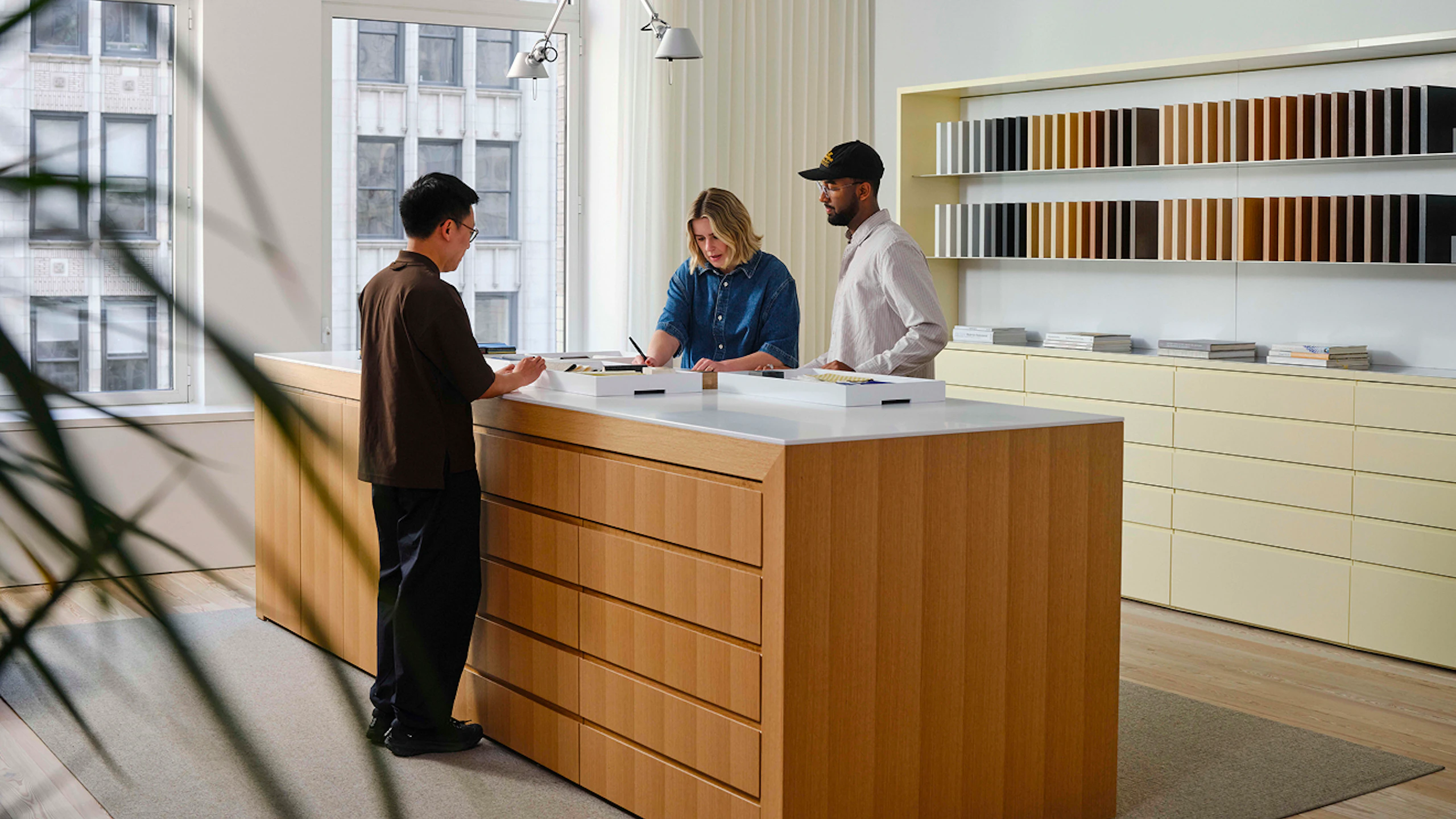
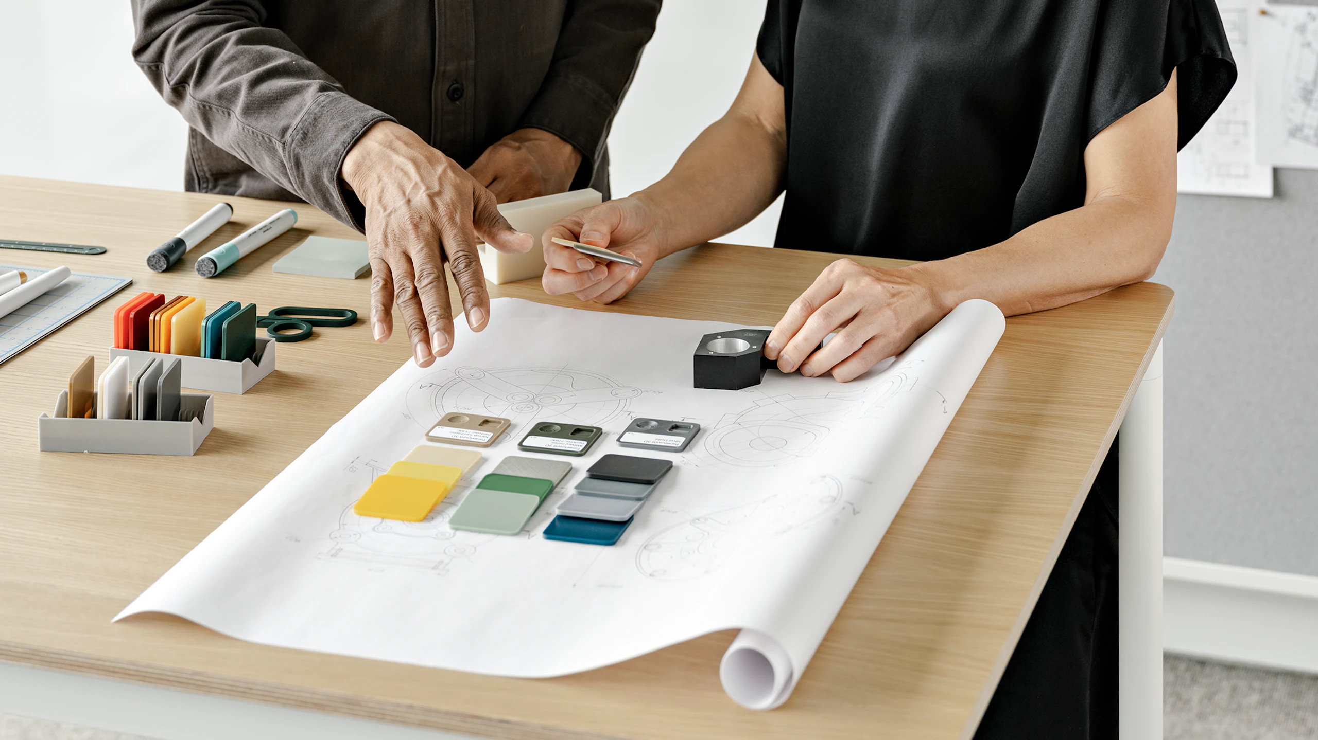
Color, a powerful and multifaceted tool, is widely considered the most recognizable element of design. It’s often unfortunately treated as a mere surface-level decision, but its impact runs much deeper. When used strategically, it can turn subtle design choices into meaningful experiences.
Quite simply, thoughtful color integration allows design to work harder. It shapes behavior, reinforces function, and creates enduring environments. In doing so, it influences not only how spaces look, but how people feel, think, and perform within them. It transforms the workplace from a collection of parts into a cohesive experience that supports psychological and social wellbeing.
Designing workplaces people want to return to
Interior design is undergoing a subtle yet meaningful transformation in both practice and outcomes. In the workplace, this shift is propelled by the tension between people’s innate desire for connection and their persistent reluctance to embrace conventional office environments. While designers remain committed to delivering smart and beautiful spaces that clients value, that value is being communicated in increasingly human rather than economic terms. Years of over-indexing for efficient use of space and compressed project schedules have resulted in workplaces that lack the richness and variety of experience that people crave. This is about more than wading against the tide of white worksurfaces that flood offices worldwide; it’s about addressing people’s broader sense of wellbeing.
Our 2025 Architecture + Design Leader to Leader report focused on communicating “The Value of Place” in human terms as synthesized from the perspectives of a mix of 29 senior and emerging leaders across 12 firms. Architecture firm Gensler’s 2026 Global Workplace Survey reports that nearly half of the over 16,000 workers surveyed across 16 countries want offices that prioritize physical and mental wellness (46%) and connection to nature (43%).
This sea change aligns with emerging developments at the intersection of academic research and place design practice. The International Arts + Mind Lab, affiliated with Johns Hopkins Medicine, recently published a call to action for the creation of Intentional Spaces that leverage art and science to prioritize “human health, connection, creativity, learning, and wellbeing.”
We are feeling creatures that think, not vice versa. Regardless, our minds—conditioned by culture and society at large—can overwrite the messages our bodies send.
Looking to neuroaesthetics in interior design
The buzzword behind this push is neuroaesthetics: the cognitive neuroscience of aesthetic experience that includes perspectives such as environmental psychology, biophilia, sociology, public health, and cultural studies.
Muuto has been at the forefront of applied neuroaesthetics since making a splash in 2019 with the launch of A Space for Being in collaboration with Google, Johns Hopkins, and Reddymade. The exhibit highlighted how sensory modalities in design impact not only psychological interpretation, what we think and feel, but also physiological responses such as heart rate, tension, and energy.
We are feeling creatures that think, not vice versa. Regardless, our minds—conditioned by culture and society at large—can overwrite the messages our bodies send. This should prompt us to pay closer attention to the deep and meaningful messages our bodies perceive from the world around us and take greater care in crafting those environments in the first place. Rab Messina eloquently communicates this in her story about the disconnect between her conscious preference and physiological preference for different rooms in A Space for Being.
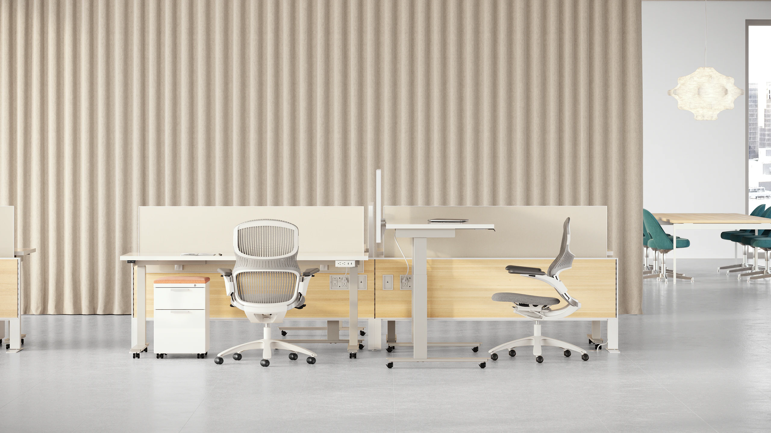
How color shapes focus, collaboration, and behavior
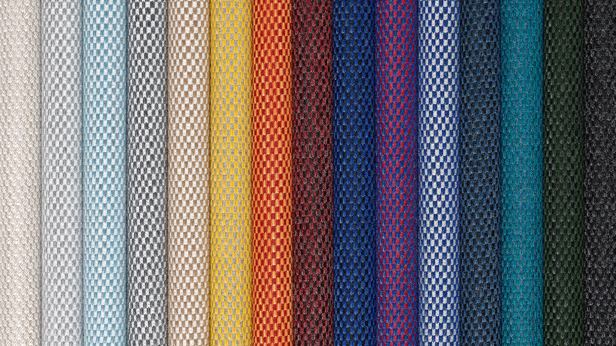
Understanding the core properties of color—hue (the color name and associated temperature from warm to cool), value (the lightness or darkness of a color), and intensity (the saturation of a color ranging from vivid to muted) is essential for effective use. These properties work in concert to shape our perception of color. While everyone’s perception is ultimately unique, there are broad commonalities documented by environmental psychology and neuroscience.
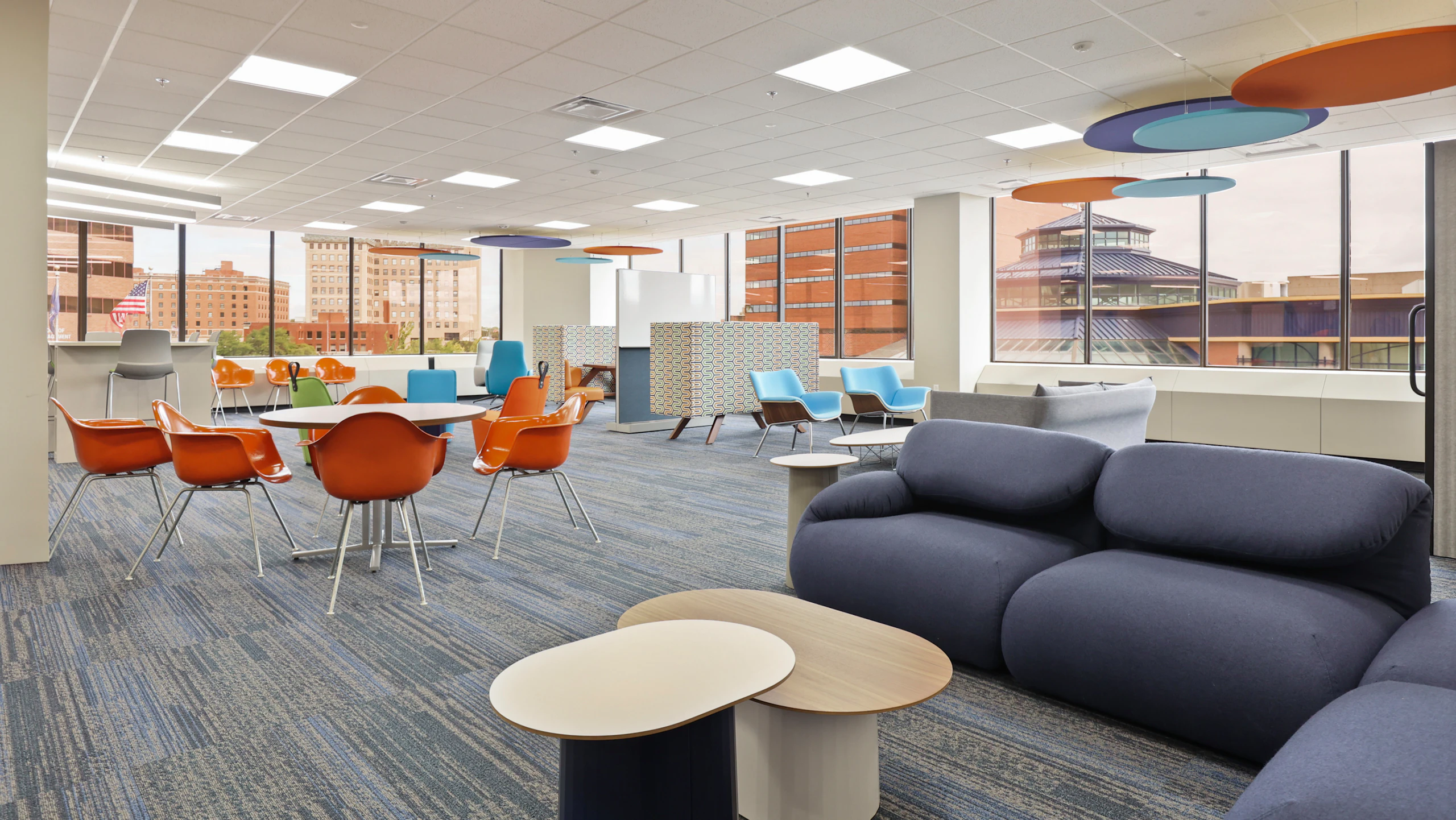
In general, colors that are warmer, darker, and vivid align with energizing experiences and collaborative work. Conversely, colors that are cooler, lighter, and muted align with relaxing experiences and focus work. Of course, no color exists in isolation; its relationship to the broader environment is the most important consideration of all.
Color for better workplace experiences
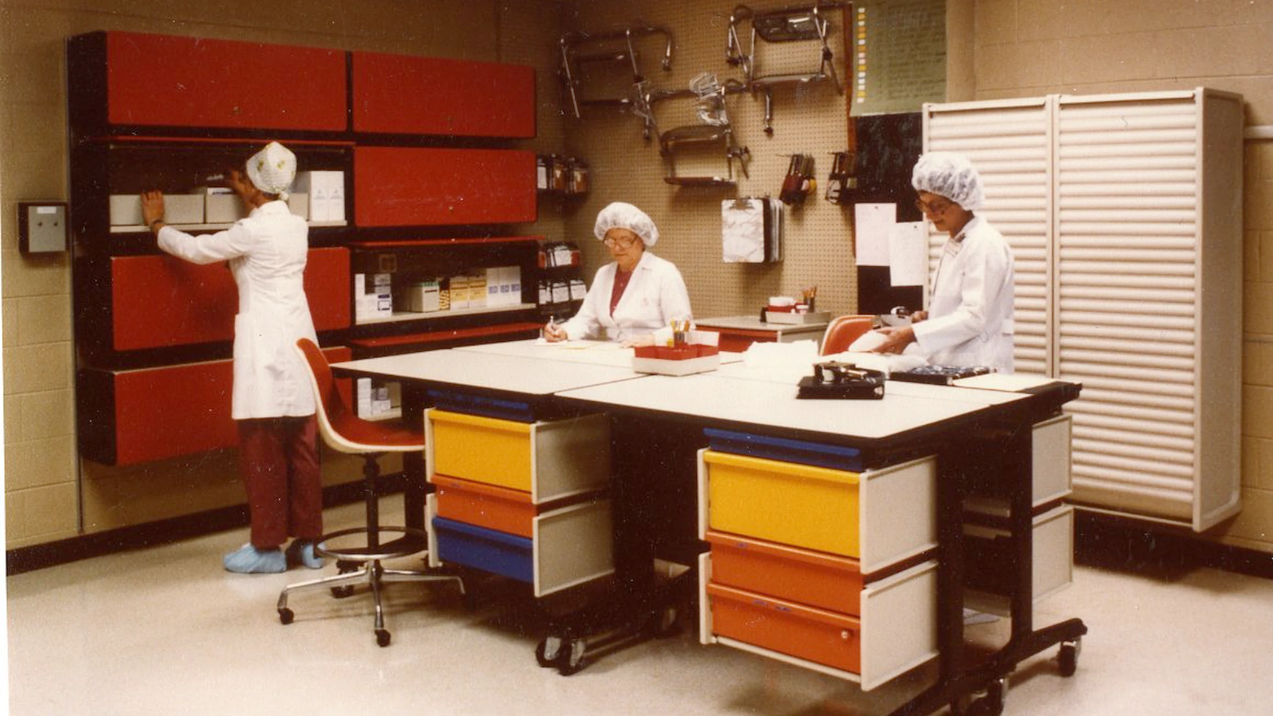
In the 1960s, Robert Propst, President of the Herman Miller Research Corporation and visionary inventor of the Action Office system, wrote: “Every office has a climate of social expression that can either be destructive or constructive, and, to a large degree, this is affected by the physical expression we give it.” In speaking to the social legibility of environments, he was highlighting the importance of people being able to understand how they fit within the bigger picture of a workplace. As the most recognizable design element, when color is specified cohesively, it can be highly effective in signaling behavioral expectations.
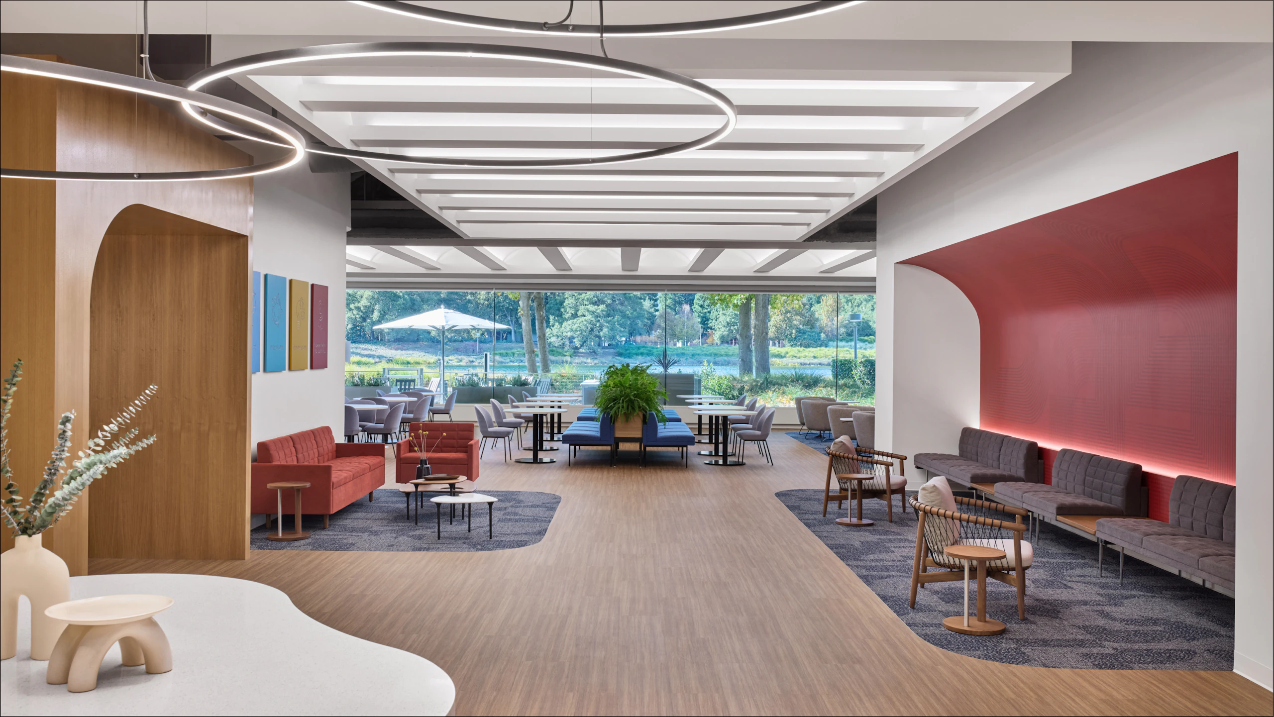
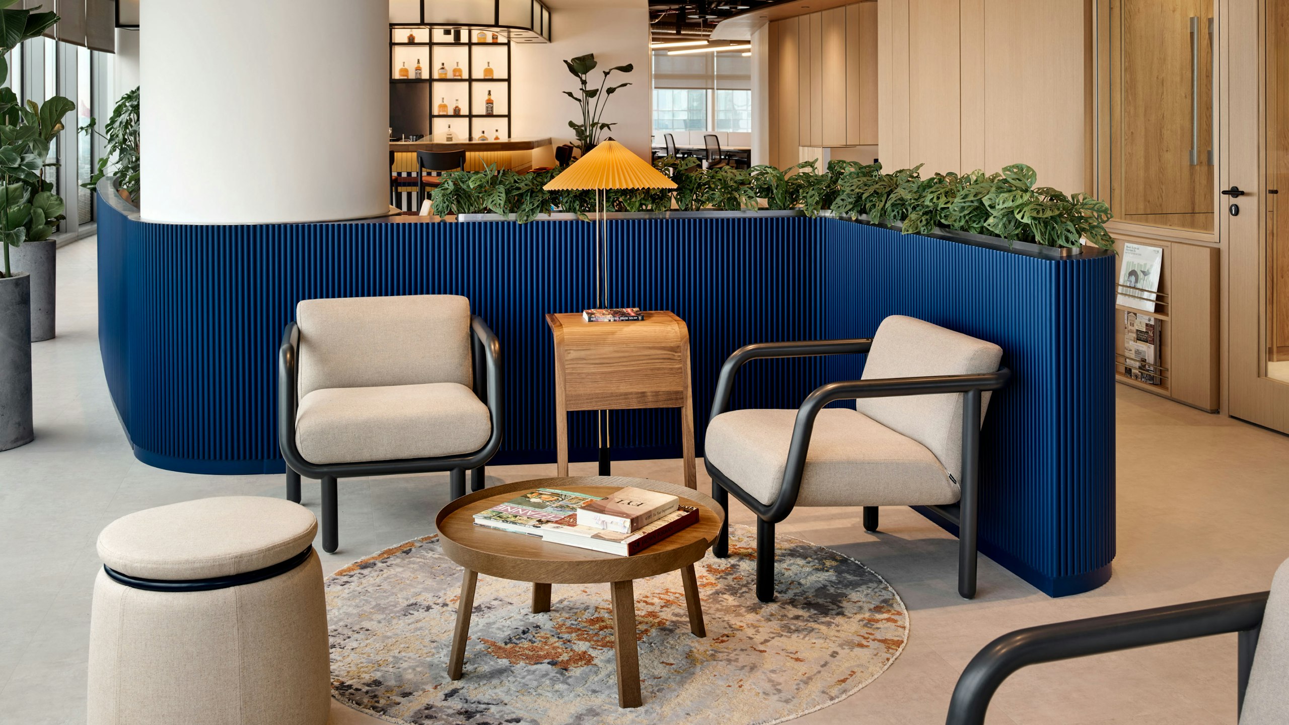
With knowledge of how color impacts our behavior, designers can create more resonant solutions. Imagine a collaborative area anchored in a biophilic-inspired palette of rich layered green and olive tones. In a heads-down workspace, waves of soft blue reinforce individual concentration and focus.
Over time, people may begin to associate green-hued environments with gathering and exchange and blue-toned environments with independent work. The space guides behavior without signage, while using colors that naturally lend themselves to those work modes. Equally important, integrating product color with architectural color reduces visual noise. This cohesion allows occupants to focus on their work instead of subconsciously processing environmental distraction.
How furniture color creates cohesive interior environments
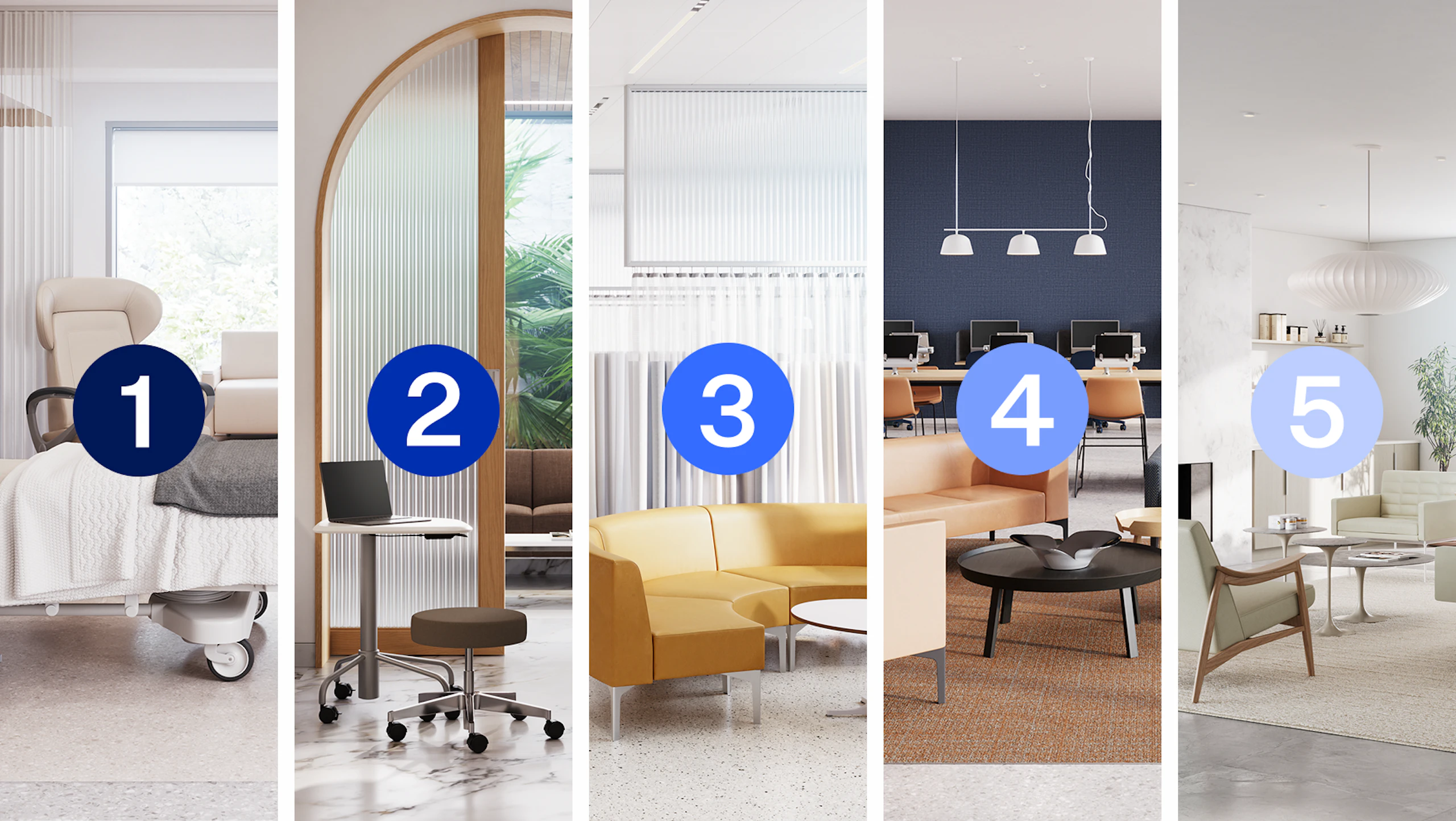
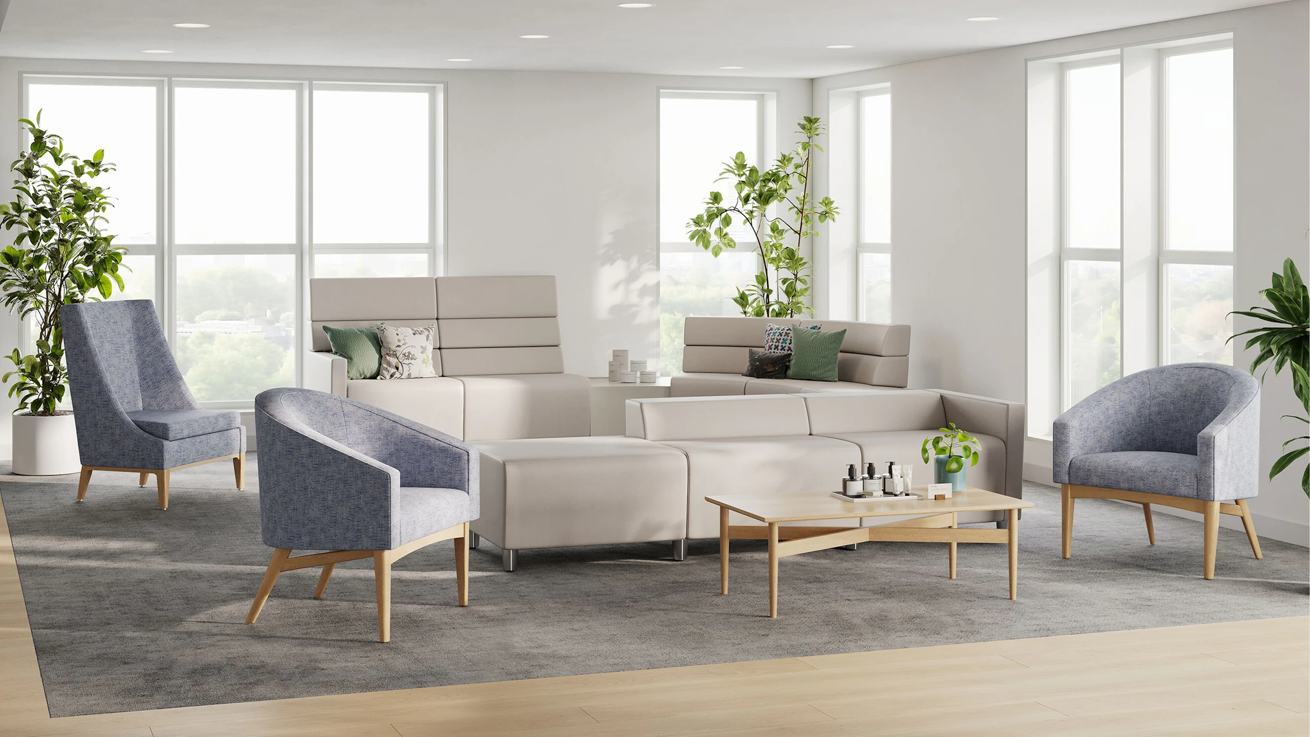
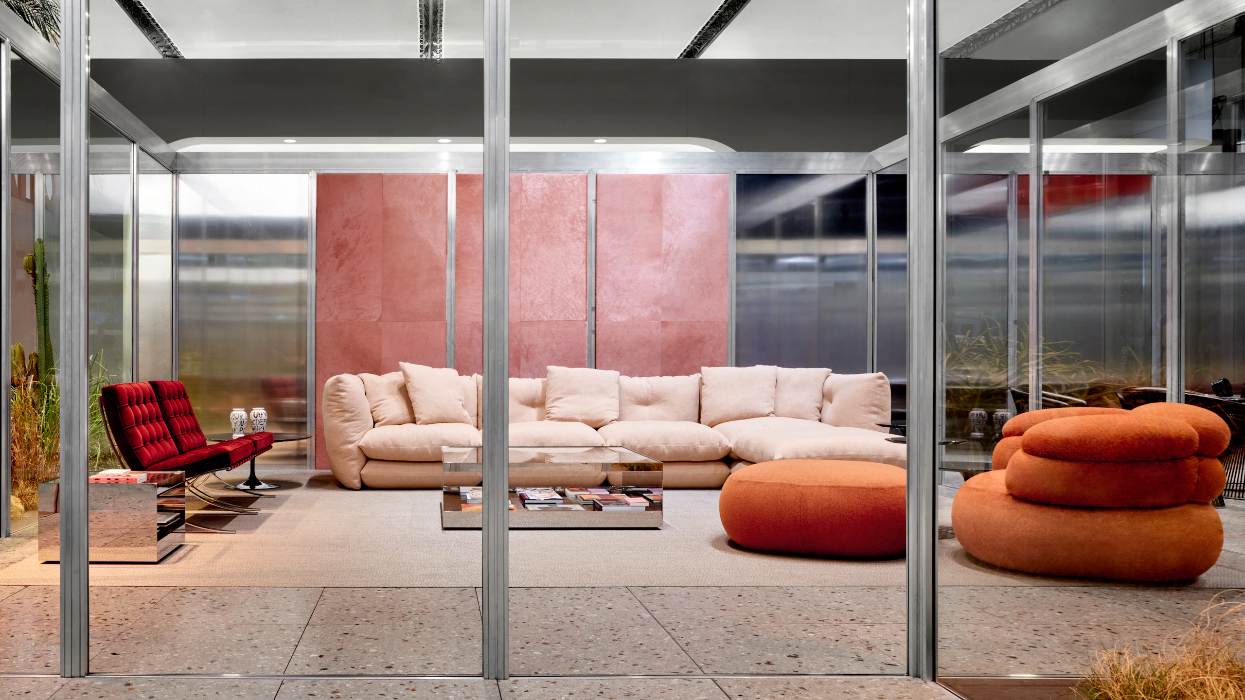
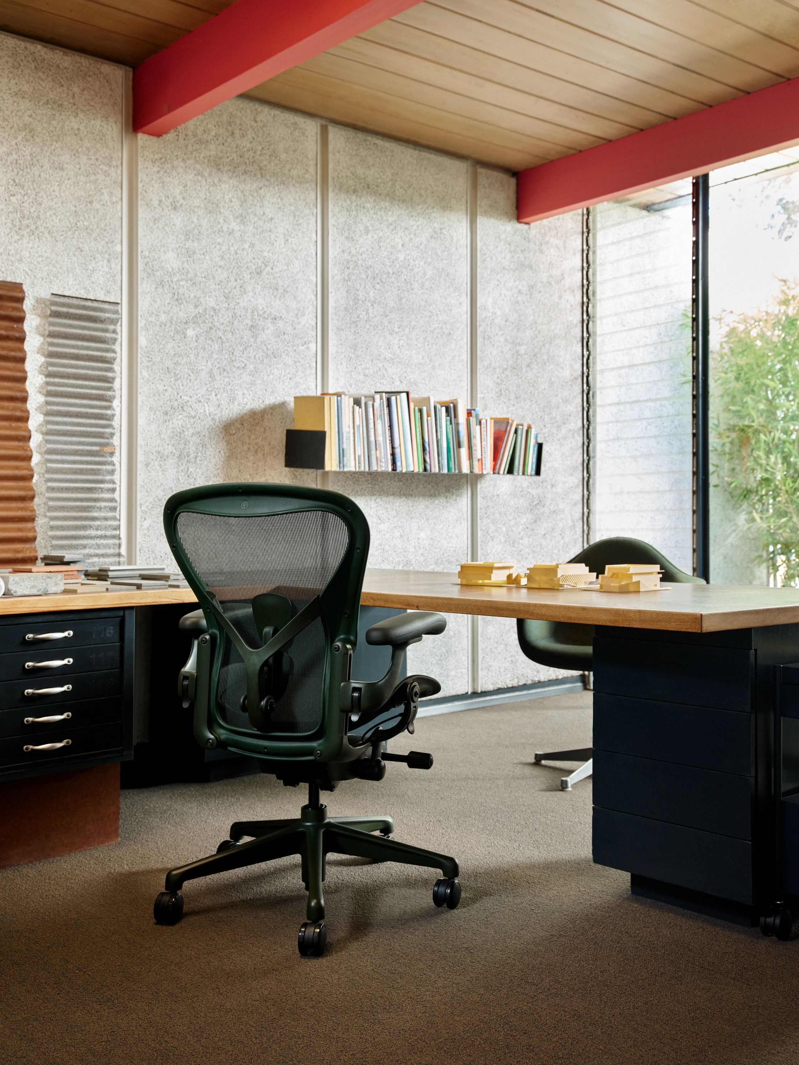
When furniture and surroundings are aligned, the environment feels deliberate rather than chaotic. Color can be specified through furniture either as part of a system or broader portfolio of loose pieces used throughout an environment. Think of the two settings described above. Instead of confining the palettes to architecture alone, furnishings can amplify the experience. The recent addition of new colors for the Herman Miller Aeron Chair are a prime example: Jasper could echo the collaborative intent of a team studio or workshop, where Aeron in Nightfall might ground an airy concentration space with a deep sense of confidence.
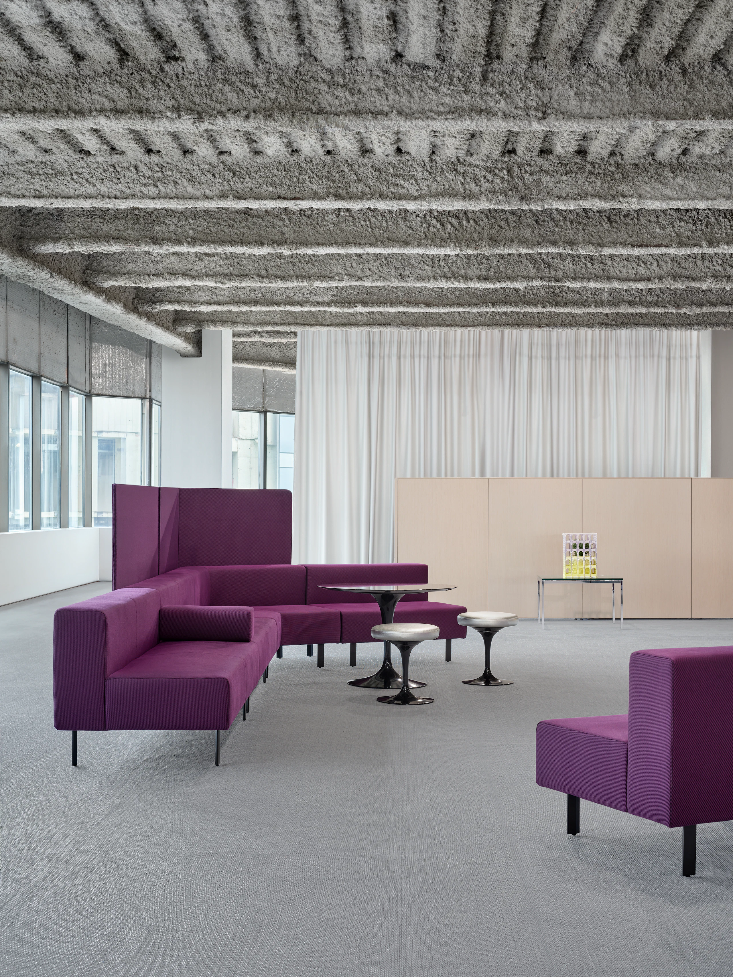
At a furniture system level, Knoll Dividends Skyline has a cohesive palette where each thing correlates to the next, in materiality, tone, texture, and feel. A generously curated mix of veneers, laminates, textiles, glass, and paints unify into a single, expressive statement across the entire floor plate.
When it comes to materiality and color, designers are not just selecting finishes; they are designing subtle, deeply resonant experiences.
About the author
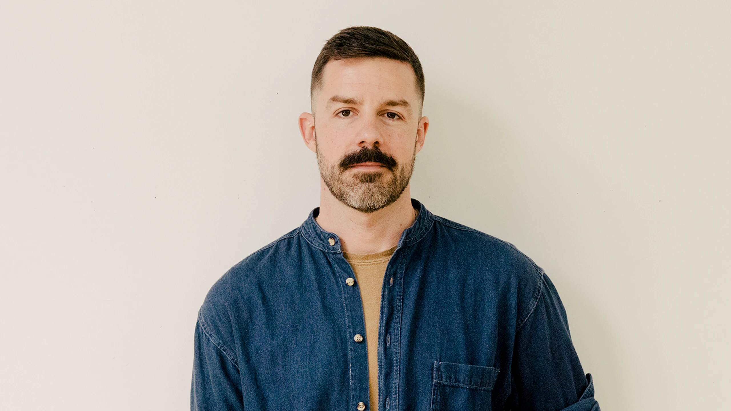
Joseph White is MillerKnoll’s Director of Design Strategy for Global Product Innovation. He integrates planning, sensory engagement, and behavioral insights to help create places that support people, focusing on scaling design knowledge and driving insight-based innovation across research, product development, and brand teams. A self-taught hand weaver, White views design strategy as “weaving with ideas instead of fiber.” He holds a Bachelor of Science in Interior Design from the University of Tennessee and has led teams in strategy roles at Rapt Studio, Herman Miller, and now MillerKnoll.
Create a workplace that feels right
From color strategy to workplace planning, our specialists can help you create environments that support the way people work, connect, and thrive